Give Inkind
Sign-up Redesign
Overview
Give InKind simplifies the process of coordinating support and care for people during challenging times. The platform helps coordinate support through meal deliveries, scheduling help, or fundraising.
Project
Give InKind was facing a high drop-off rate during its sign-up process. I was part of a UX team contracted to redesign this experience.
The team consisted of myself, serving as a UX researcher, and two UX designers. Our internal stakeholders at Give InKind were the Project Manager and the Head of Design.
Research Objectives
Develop a better understanding of people that use the Give Inkind platform (Generative)
Identify specific goals, issues, and use cases that people come to the platform for.
Discover unmet user needs and current usage patterns of the platform.
Uncover gaps in the product, specifically the sign-up process.
To assess the usability and effectiveness of the redesigned sign-up process. (Evaluative)
Evaluate whether the instructions and information provided during sign-up were clear and easy to understand.
Identify any points in the sign-up process where users experienced confusion or uncertainty.
Deliverables
The deliverables for this project were:
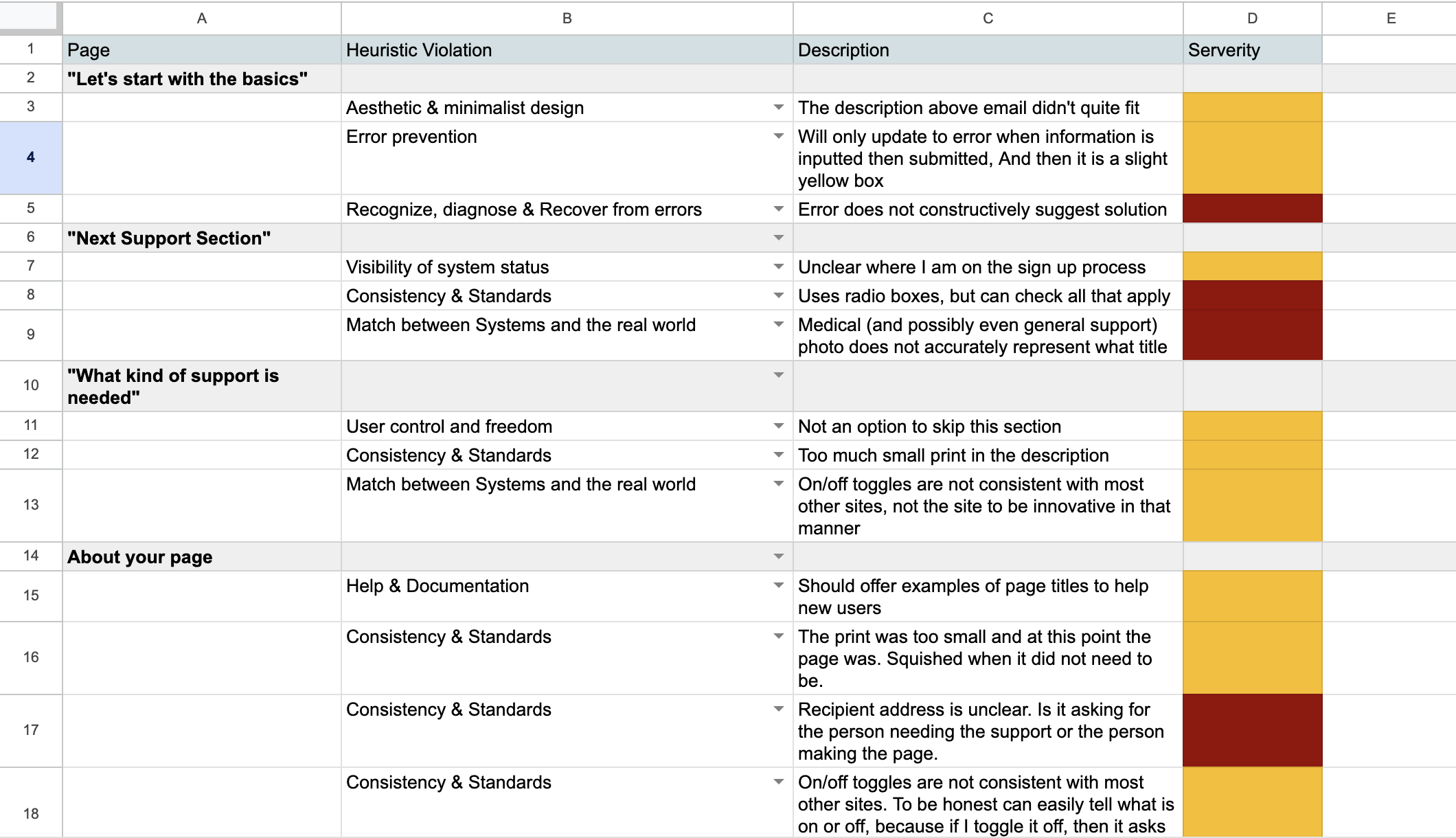
Heuristic Evaluation Report: A document detailing the usability issues found in the current sign-up process.
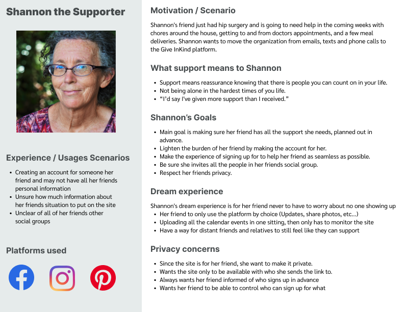
Primary User Persona: A role-based persona of the primary user of the platform.
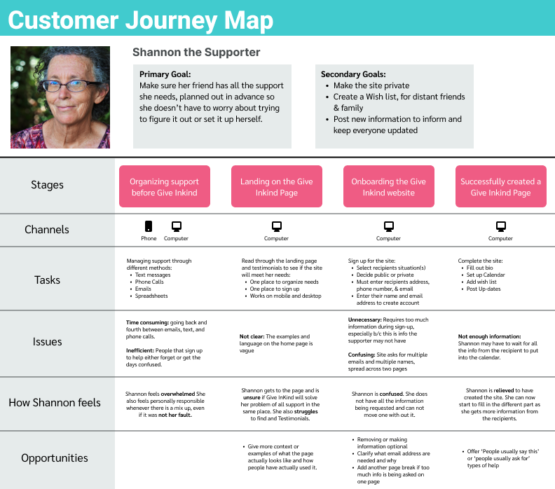
Customer Journey Map: A visual representation of the primary persona journey from initial contact through the entire sign-up process.
Figma Prototype: A completed prototype of the redesigned sign-up process.
Usability Testing Report: Findings from the concept/usability testing of the prototype.
Final Report and Presentation: A comprehensive report and presentation detailing the methodologies, findings, and recommendations from the project.
Heuristic Evaluation
The team chose to start with a heuristic evaluation because they are cheap and effective. Heuristic evaluations are efficient, uncovering numerous usability issues with minimal effort. Additionally, this was important because we only had enough resources within the project to do 1 round of usability testing. Identifying numerous usability issues upfront was crucial before initiating the redesign..
The evaluation’s chosen scenario involved an individual visiting the site for the first time to to sign up for support.’
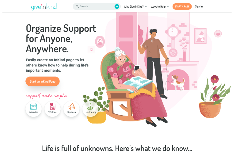
The journey began on the Home page. This was the users first interaction with the website. Consequently, the home page was crucial to the sign-up process. Analytics also supported this, showing it was the most popular page for user sign-up.
‘Start a page' process: Understanding the current process was crucial, given its primary importance to the business goal of the redesign.
(Note) Though outside our current scope, its important to note that the navigation and support articles on the site would have also been beneficial to include. These articles often times provide context and examples, showing users different the ways the site has been used before.
Method and Process
We choose Jacob Nielsen’s 10 Heuristics for Usability. This was a well know and trusted Heuristic that covered usability in an interactive design.
In-total, there were 10 pages in the process; the home page and 9 pages in the sign-up
All 3 of us conducted the heuristic over a 2-day period.
We met together on the 2nd day to compare evaluations, discuss what we saw, and note any immediate usability issue to address in the redesign.
Key Findings
The home-page struggled with help and documentation. It was not clear the types of help offered or how specifically they work. Users would need to look at articles or reference the FAQ.
The sign-up process violated the:
Aesthetic and Minimalist Design: Too much information was asked for in the sign-up process that was not necessary to create an account.
Error Prevention: Points closer to the end of the sign-up would not let users continue because of missing information, but the information missing was not highlighted or called out. This went hand and hand with the Aesthetic and Minimalist design, because this information was not necessary for completion of the sign up.
Visibility of Systems Status: There was not clear indication of where you were in the sign up process, or how much more was left.
After we finished, we sent the key findings, example attachments, and the Heuristics itself to the PM.
User Interviews
Starting with assumptions
During discussions with stakeholders, we identified two primary assumptions at the project's outset:
Users building a page for themselves come to Give InKind in a more fragile emotional state. The founder created the site due to a lack of support-offering type of platform. When they were seeking out out different platforms before creating this organization, they remember a very challenging emotion state.
Requesting excessive information during the sign-up process would increase the likelihood of abandonment. Generally, the more information you ask for in a sign-up process, the higher the drop of rate will be.
Establishing Criteria to recruit for
The recruitment was all done by the by the Project Manager at Give InKind. In total we spoke with 11 people. The criteria was as follows:
Created a Give InKind page in the last 3 months
Successfully created 3 events on the Care Calendar (a calendar showing the types of support needed for the individual)
Developing the discussion guide
We developed a semi-structured discussion guide for the remote, 60-minute Zoom interviews. Our challenge was to explore users' broader goals and issues beyond their interactions with Give InKind, while still relating their experiences back to the platform.
A significant challenge was uncovering the participants' overarching goals, issues, and beliefs outside of their use of Give InKind. Being users of Give InKind, they may have a predisposition to try and answer our questions in terms of the platform. It was the job of the interviewers to guide these conversations to the experiences outside the platform and be able to bring it back to the platform when ever needed.
Research questions
Our research questions focused on the participants' experiences of giving and receiving support prior to using Give InKind, the nature of the events leading them to the platform, and their subsequent experiences with Give InKind."
Interviews
We split up the interviews, I did 7 and the other designers did 2 each. We decided on a thematic note-taking style.
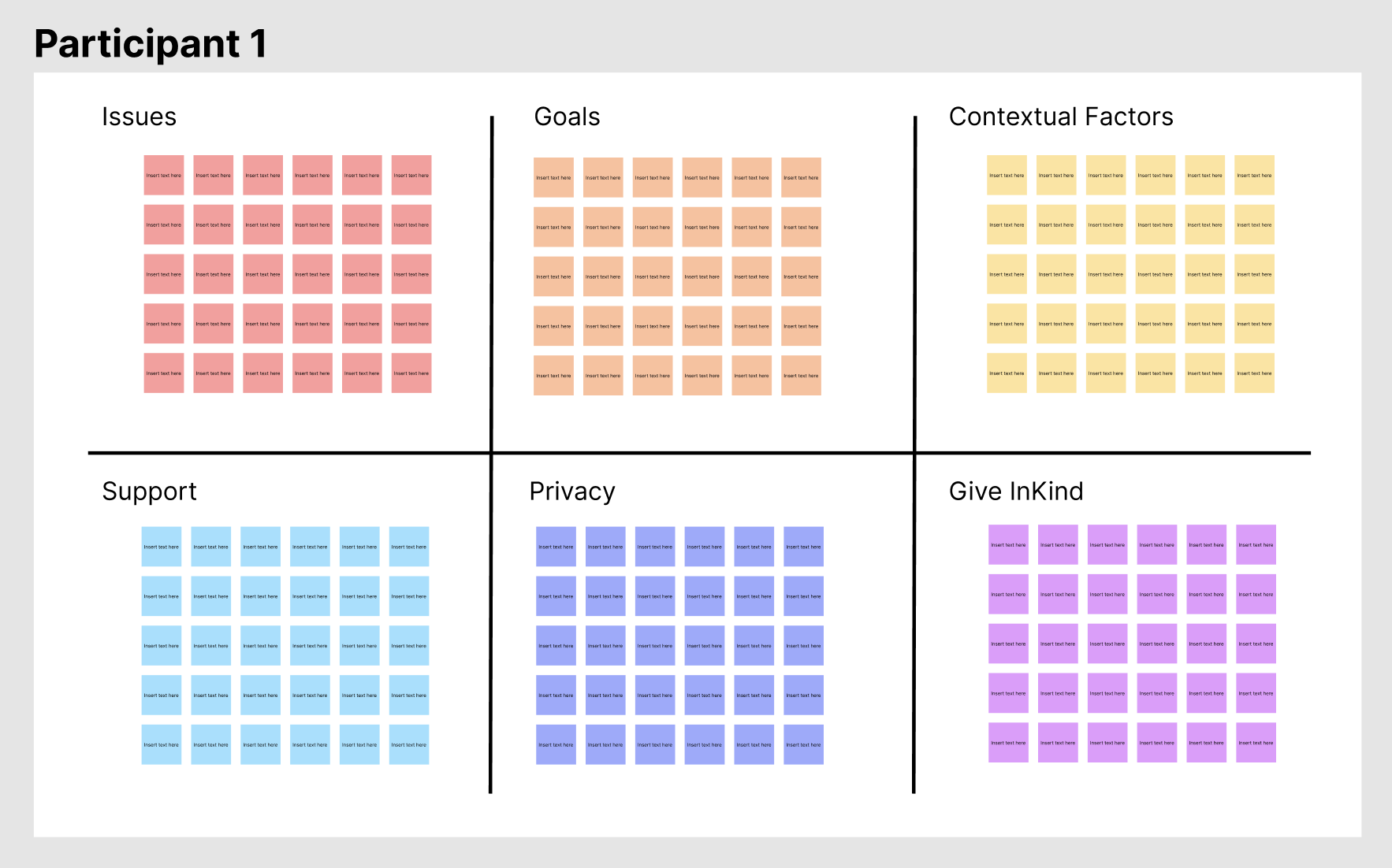
Issues: Something that is/was a problem
Goals: Things the users are trying to accomplish
Contextual Factors: The different factors contributing to them needed or giving support
Support: Information on giving and receiving support, working with others, volunteering, etc…
Privacy: Anything about sensitive information, sensitive data, trust, or personal privacy
Give InKind: Any information about the platform
These themes were determined before the interviews as areas of focus. Issues and goals were key to building personas and customer journey maps. The Information on support, privacy, contextual factors, and Give Inkind came directly from the research questions.
Our goal for formatting the notes with determine tags was to save time and make note-taking easier for the team.
Synthesis and Analysis
We utilized Figma for our synthesis and analysis process.
We organized all interview notes from participants on post-its, categorizing them into the six previously mentioned sections. To optimize our workflow, we divided the synthesis process into manageable phases.
We first took notes for the first 6 interviews and put them on the Figma board.
Then we synthesized the first 6 participants data.
Next we conducted the last 5 interviews and brought them to the board.
Lastly, we did the final synthesis and analysis with all 11 users, layering the last 5 participants into the already synthesized data.
We did this to save time. Normally a larger synthesis can be daunting, cumbersome, and extensive. This division allowed us to avoid feeling overwhelmed. Starting with six participants provided a solid foundation to identify patterns. The synthesis was done without the PM unfortunately, as they did not have time to participate.
Synthesis and Analysis process
We started by tackling the goals section. We guessed that this would be the basis from which all the pain-points and issues would come from. The goals seemed to fall into 2 sections:
Basic needs goals: Ones that are more common and typical (get groceries delivered, have someone take my husband to therapy, etc…)
Value-based goals: These goals went a level deeper, showing some of the motivations behind goals that were specific to the individual (What it means to give support, how they want to make others feel, etc…)
With the goals organized, we brought in the issues and matched them to each section. Our hypothesis posited that basic goals would address immediate needs, whereas value-based goals would reveal deeper motivations. This theory was confirmed through our findings.
The majority of the people we spoke with, nine out of eleven, created accounts for others. While they made the accounts for their friends and families to meet their basic needs, there seemed to be more to it than that. Themes of ‘support is about not feeling alone’, 'I feel deeply gratified helping others’, and ‘I often give support more than I receive support’ kept emerging. All these themes were the motivations that lead these type of people to step up and help out.
What also came out of the interviews was the need for privacy. All 11 users made their accounts private. Interestingly enough, though they were all concerned about privacy, the mere ability to make the account private brought a feeling of security to them. Outside of that, there was not much more that was required to make the accounts feel safe.
Persona
The primary persona we identified was 'Shannon the Supporter,' reflecting that most users we interviewed created sites on behalf of others
Additionally, our analytics confirmed that approximately 80% of primary users create sites for others.
Customer Journey Map
We developed a persona-specific customer journey map, a decision driven by the fact that 80% of our users create sites for others, making this approach the most impactful when focusing on the sign-up redesign.
-
(All previous to interacting with Give InKind)
How did these experiences differ?
What were the feeling surrounding both of them?
Was there one they were doing more than the other?
-
What was the situation that they were trying to get support for
What were some of the issues they faced?
Did they have a support systems going before the Give Inkind?
If so, what did that look like?
Who was involved
How were they coordinating the support?
-
How did they discover Give Inkind?
What other platforms did they come across?
What made them use Give InKind?
Onboarding
Overall experience
Device used
Alone or with someones else
Using Give InKind
Experience with Care Calendar
Other features they’ve used
Challenges they’ve had
Feedback
-
How, if at all, has privacy come into their experience with Give InKind?
Was their page public or private?
Talk about why that is.
Did they have any privacy concerns when joining Give InKind?
If so, how did they address those concerns?
Any feedback on privacy?
Usability Testing
Sign-up Redesign
The designers synthesized information from heuristic evaluations, user interview feedback, and insights from the customer journey map to initiate the redesign process.
Prototype Flow
This is a simplistic flow of screens opposed to the actual prototype. This is more to give context for usability findings then to display the redesign.
Recruiting
While the redesign was taking place I worked with the PM to recruit 6 more people for these tests. We were more interested in 6 people who have not used the site before and have given their time to support someone or something. Given that we had only one round of testing, we chose to combine concept testing with usability testing.
Testing
Seeing we only had one round of testing, we decided to mix a concept test with a usability test. We had hour long interviews scheduled. Although our primary focus was on redesigning the sign-up process, we believed a lot could be learned about the landing and profile pages.These were both important to the sign-up process.
The testing looked as followed:
-
We asked them what they think the purpose of the site was.
How would they explain it to a friend of theres?
Is there anything unclear?
What is missing?
-
We gave them a scenario:
“Imagine you’re friend has contracted covid can’t leave the house. He lives alone. He has a mix of family and friends, some nearby and some further away. All of them want to help and are interested in regular update.
Followed by a task:
Create a support page for your friend. They need help with groceries, potential meal drop offs, and a few items from CVS and Target.The task was purposely vague. We gave them enough information to create an account that could be solely calendar based, can include gift cards, can have a wishlist, etc…
-
After they signed-up, we had them do a similar concept test of the profile page.
We asked them what they think the purpose of the page was.
How would they explain it to a friend of theres?
How do they imagine posting update
Is there anything unclear?
What is missing?
Findings
Landing page (concept)
Participants expressed significant confusion regarding the site's purpose. "Is this a social media platform?", "do I sign up to receive support from random people?", "is this a charity?", and "is this a give away?" were some of the questions that came up around the platform.
Additionally, we observed that many participants completely bypassed the middle sections of the landing page while exploring the site.
Sign-up (Usability)
Who is the page for:
Participants easily made the page for another person.
Support type:
Participants were able to find and create an account for COVID-19 support.
A few participants were confused by some other labels.
Participants seemed unclear if they could select multiple things at once.
Calendar:
Participants were able to schedule dinners.
Participants mentioned not wanting to do this during sign-up though.
Wishlist:
Participants were able to easily add gift cards.
Participants easily added gift cards, although there was some confusion about how these gift cards were generated.
Profile Information (Concept)
" I wish I could have known I can make my account private in the beginning [of the create a page process]." This again touched on the concern for privacy that we had thought we'd addressed.
The different options of privacy were appreciated.
Client Handoff
Prototype iterations
Before the client handoff, we implemented the following iterations to the prototype:
We added a feature allowing page privacy settings in the 'Who is this page for' (beginning) section.
We revised the language on the support type page to clarify the ability to select multiple support options.
We entirely removed the calendar from the sign-up process, as its inclusion previously created significant complications in the completion process. It is already on the profile page and managed from there, so it served no valuable purpose being in the sign-up flow.
Presentation
The UX team presented our findings to the CEO, Director of Design, and Project Manager. The presentation comprehensively detailed the project's entire process, from initial research to final design. We also handed over key deliverables including the Persona, Customer Journey Map (CJM), Presentation Deck, and Figma file.
Suggested next steps
Design and test a mobile version of the site, considering the significant number of users who sign up via mobile.
Conduct further research on the gift card section of the site. Many participants internalized the options offered and felt they were not suitable.
Continue usability and concept testing with the homepage. Although it was not part of the initial redesign, it emerged as a confusing piece for the participants.
